
Color is one of the most important aspects of logo designs, but at the same time can be one of the most difficult things to grasp. In this post, we recommend two to three color combinations you should try using in your next animated logo.
1. Black and Orange
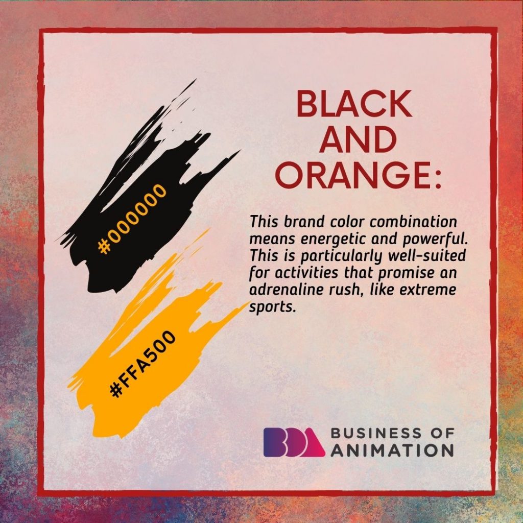
This brand color combination means energetic and powerful. This is particularly well-suited for activities that promise an adrenaline rush, like extreme sports.
2. Navy and Orange
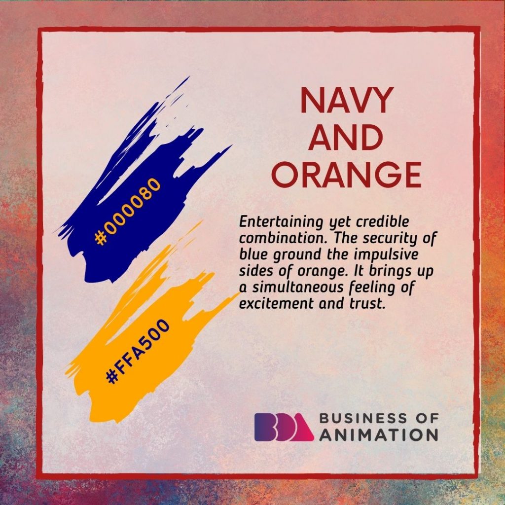
Entertaining yet credible combination. The security of blue ground the impulsive sides of orange. It brings up a simultaneous feeling of excitement and trust.
3. Maroon and Peach
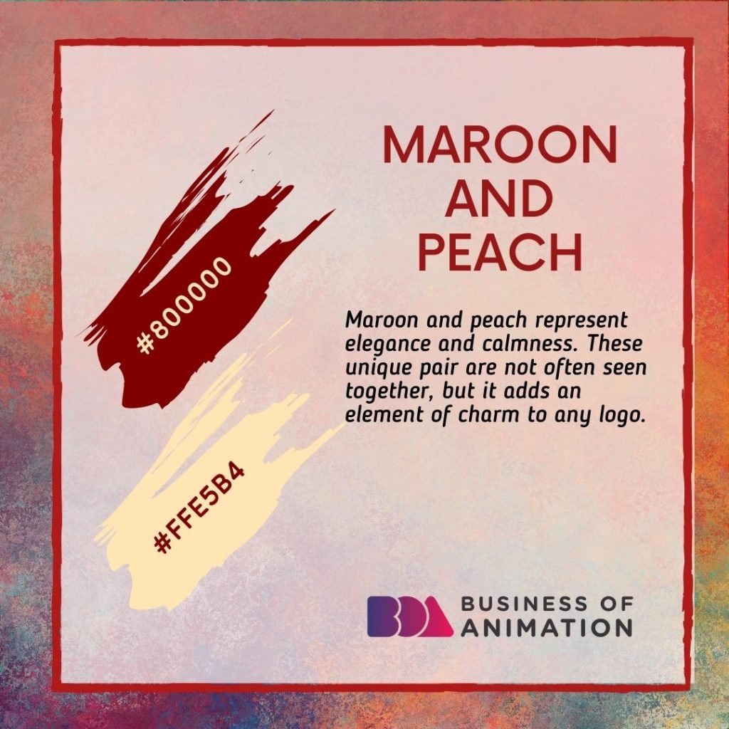
Maroon and peach represent elegance and calmness. These unique pair are not often seen together, but it adds an element of charm to any logo.
4. Dark Blue, Turquoise, and Beige
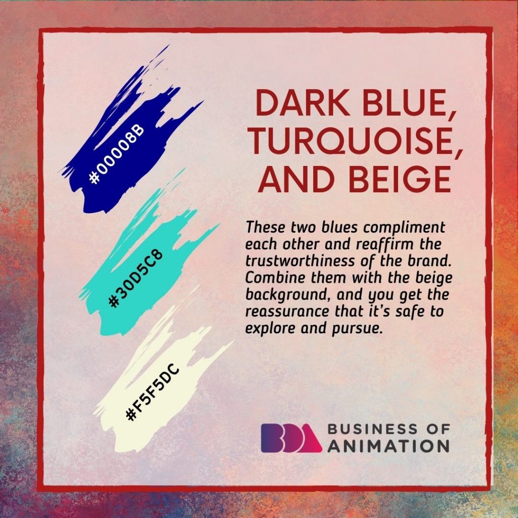
These two blues compliment each other and reaffirm the trustworthiness of the brand. Combine them with the beige background, and you get the reassurance that it’s safe to explore and pursue.
5. Navy, Beige, and Yellow
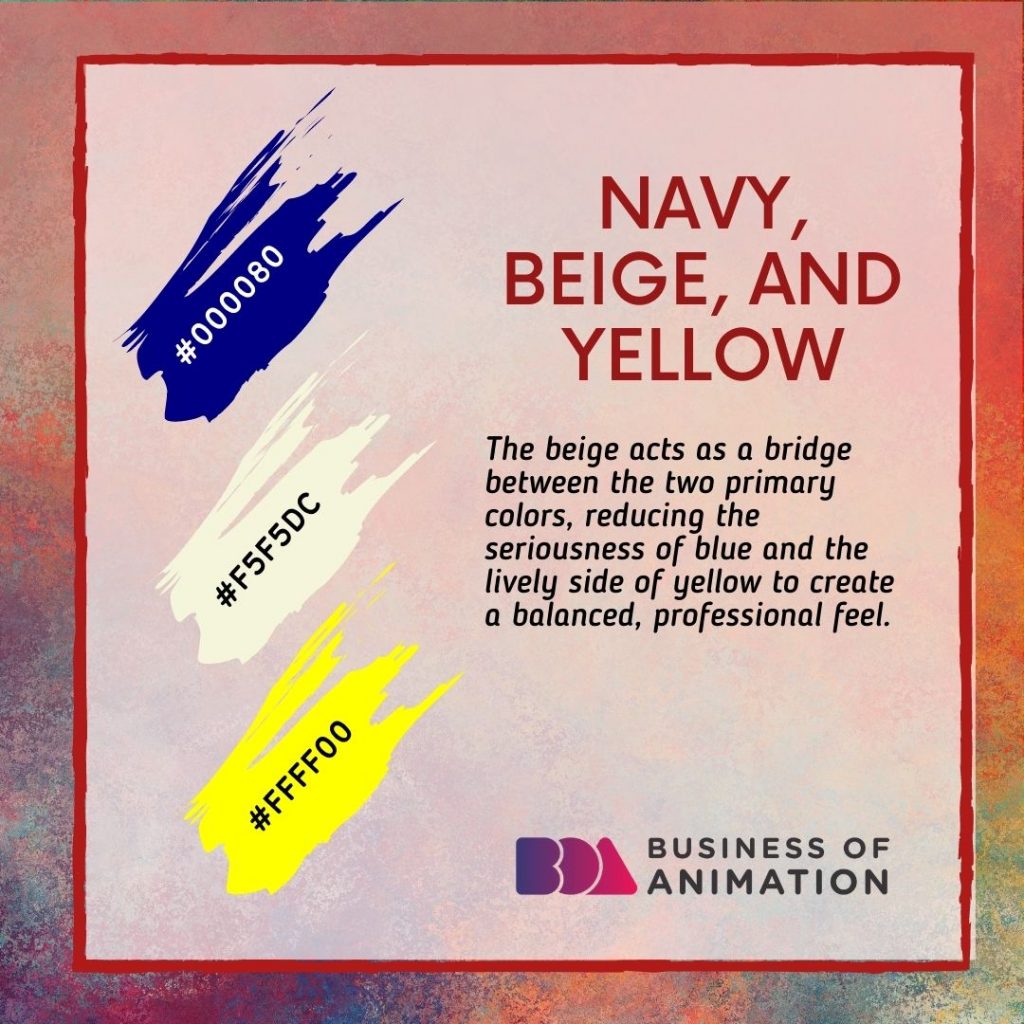
The beige acts as a bridge between the two primary colors, reducing the seriousness of blue and the lively side of yellow to create a balanced, professional feel.
6. Beige, Brown, and Dark Brown
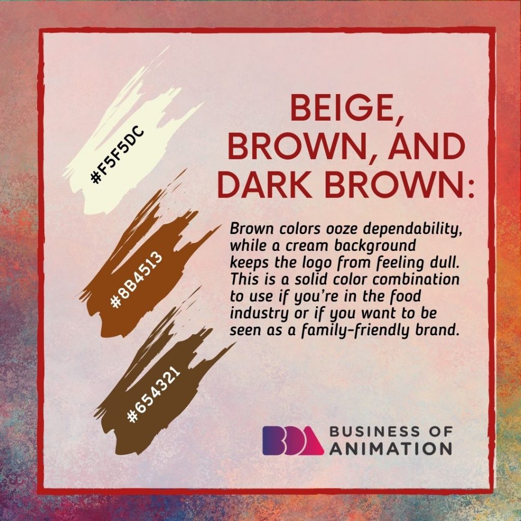
Brown colors ooze dependability, while a cream background keeps the logo from feeling dull. This is a solid color combination to use if you’re in the food industry or if you want to be seen as a family-friendly brand.
Check out Business of Animation's blog for more in-depth tips on how to grow your animation business!